(01)
Birdie is a visual Fresh Air Monitor that helps
people worldwide achieve a better indoor climate.
[→]
Agency:
Baseborn
[→]
Industry:
Tech
[→]
Category:
Brand Identity
Background

Credits
Total Credits:
(02)
Simon Holm Larsen
Lead Brand Designer
Baseborn
Tore Sebastian Bentsen
Lead Digital Designer
Baseborn
(
0
1
)
Birdie

Description
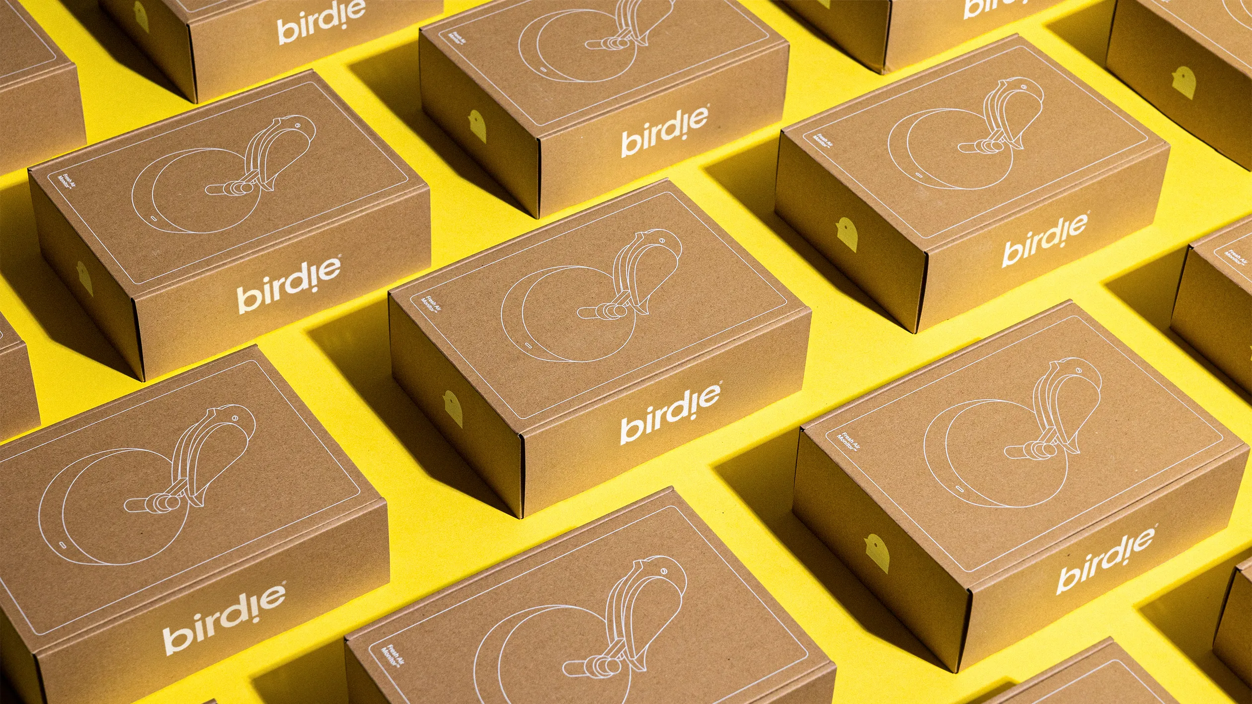
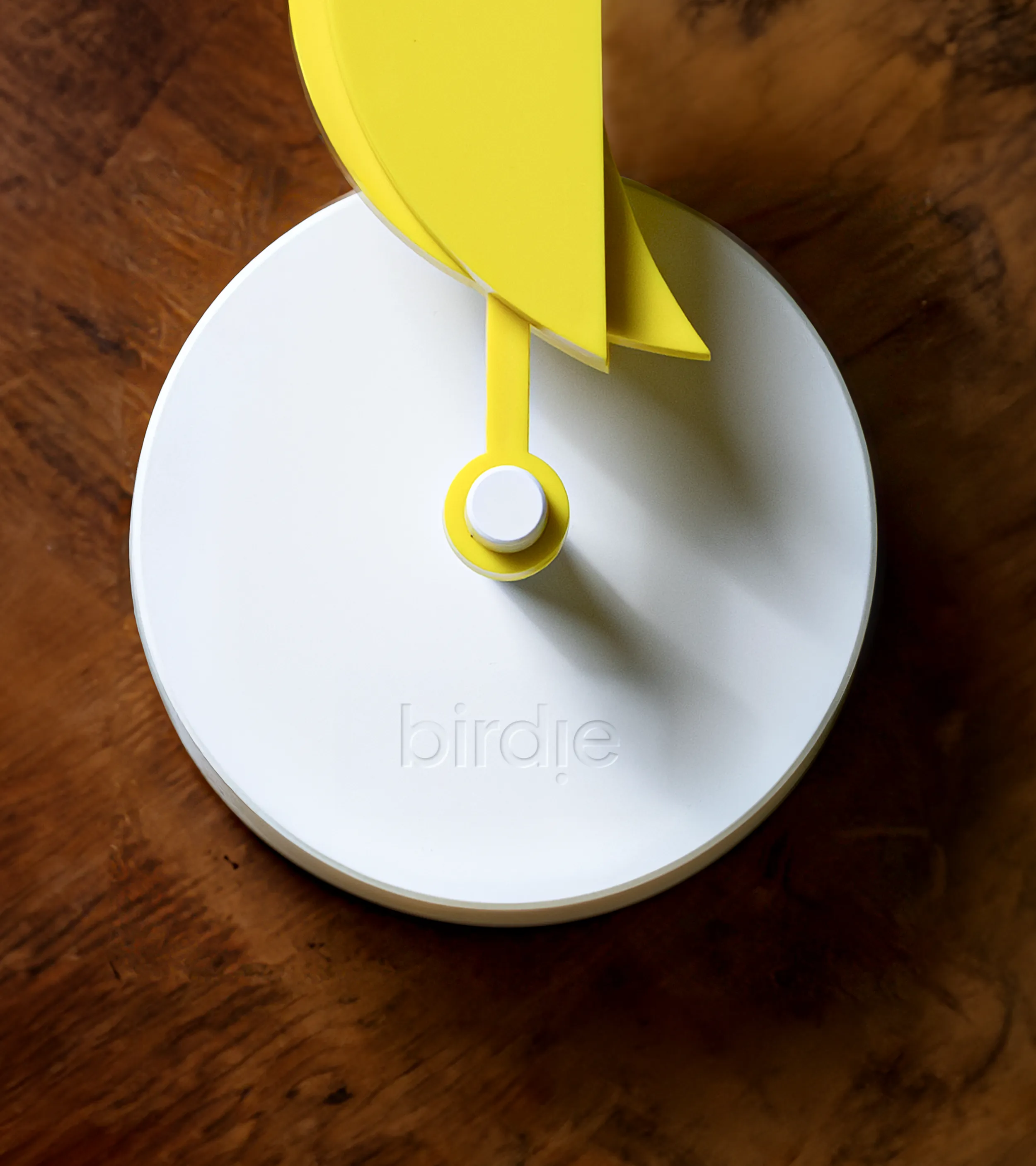
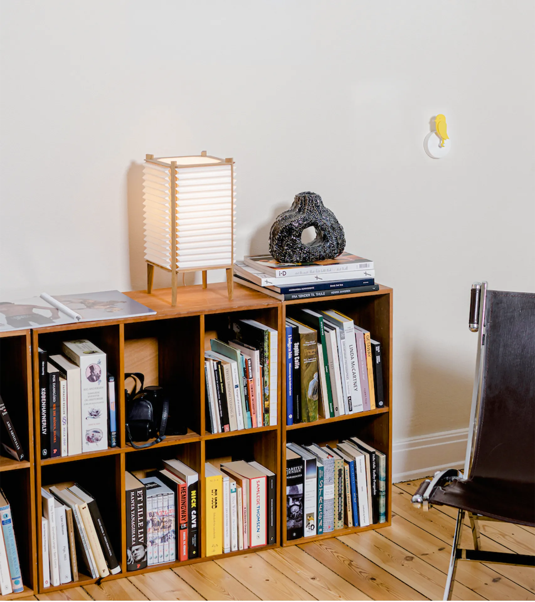
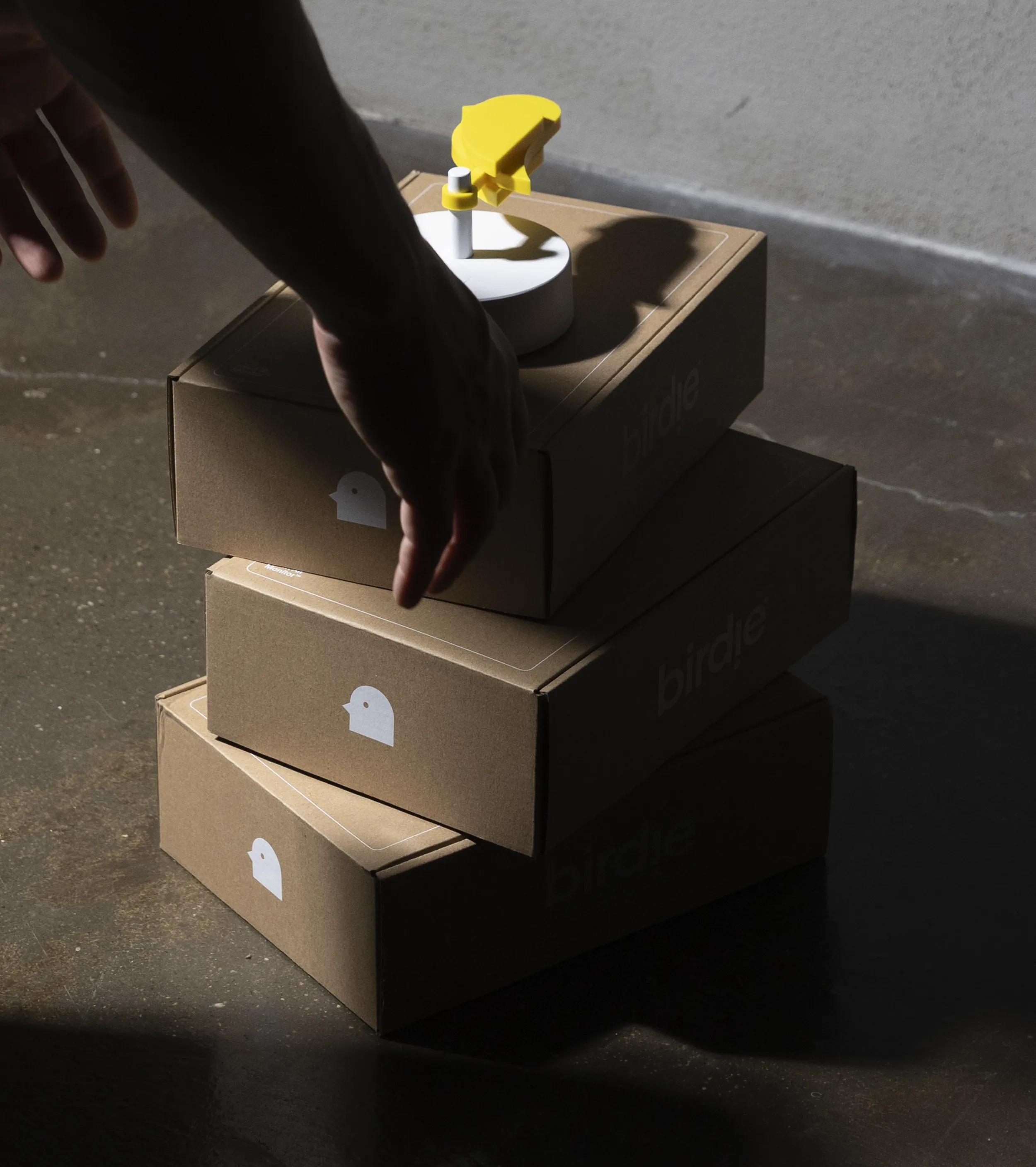
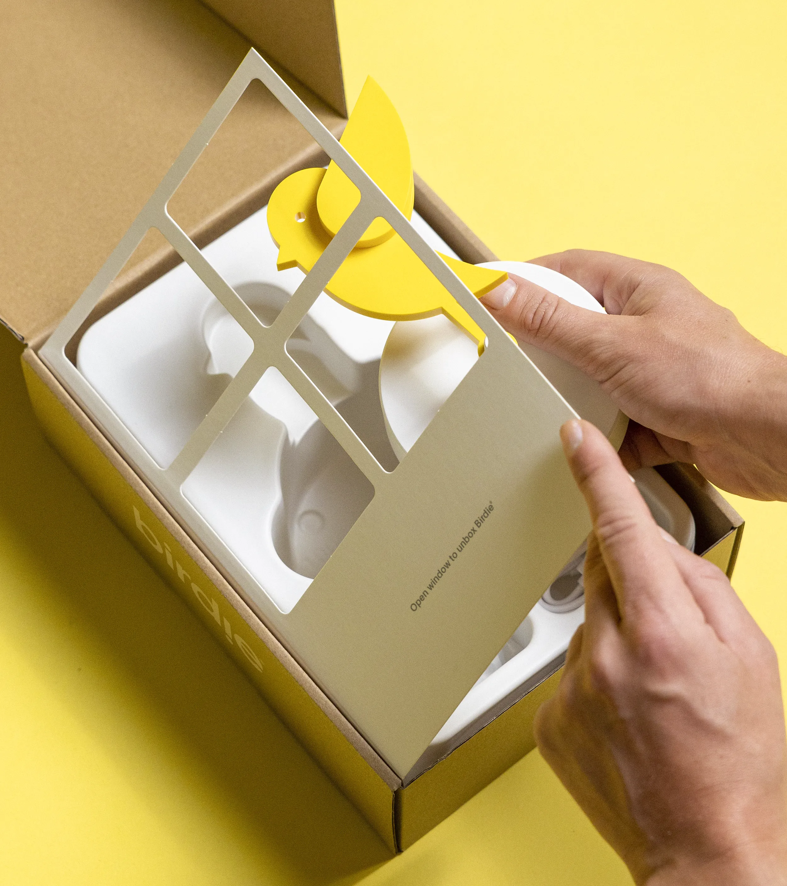
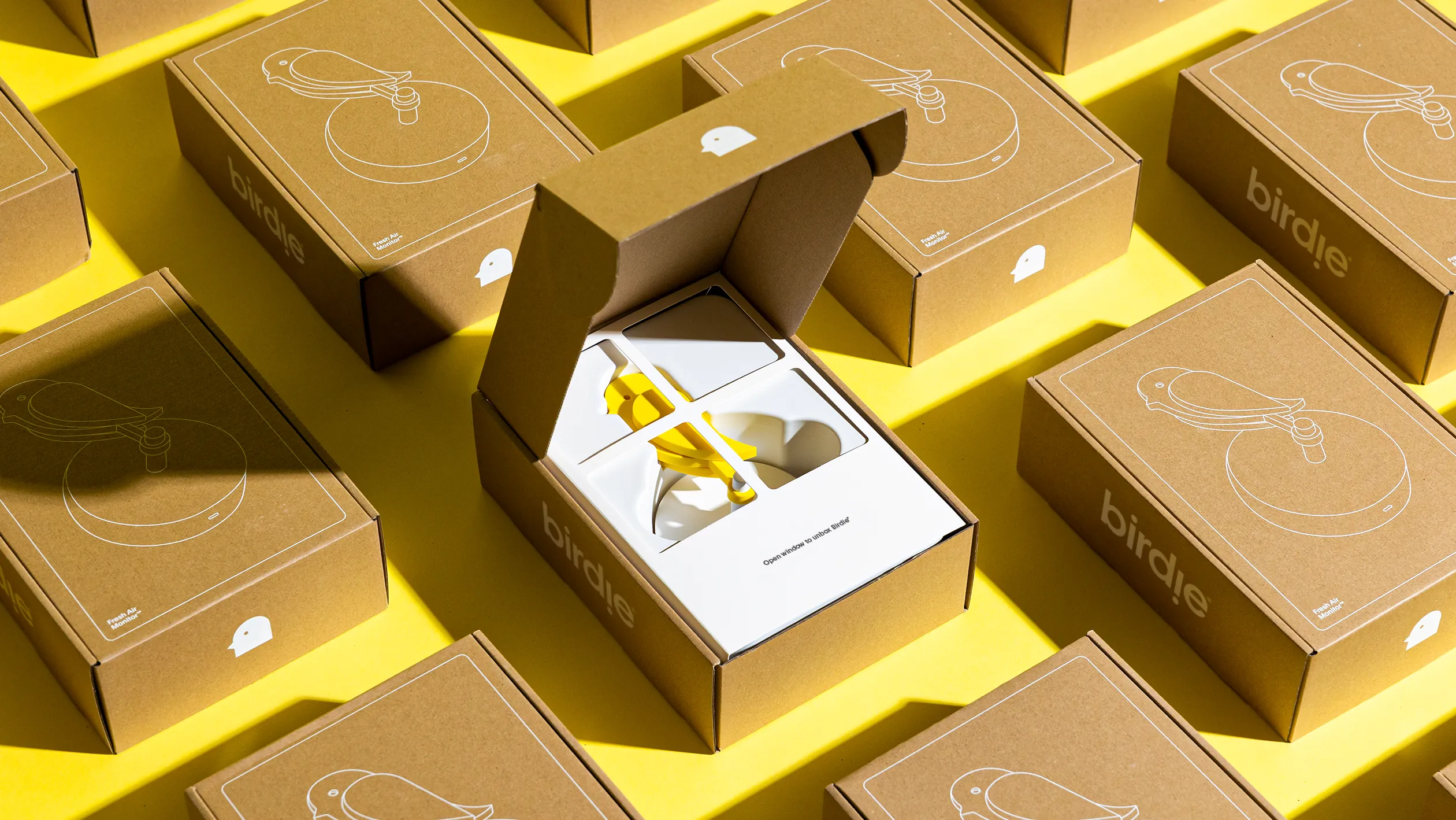
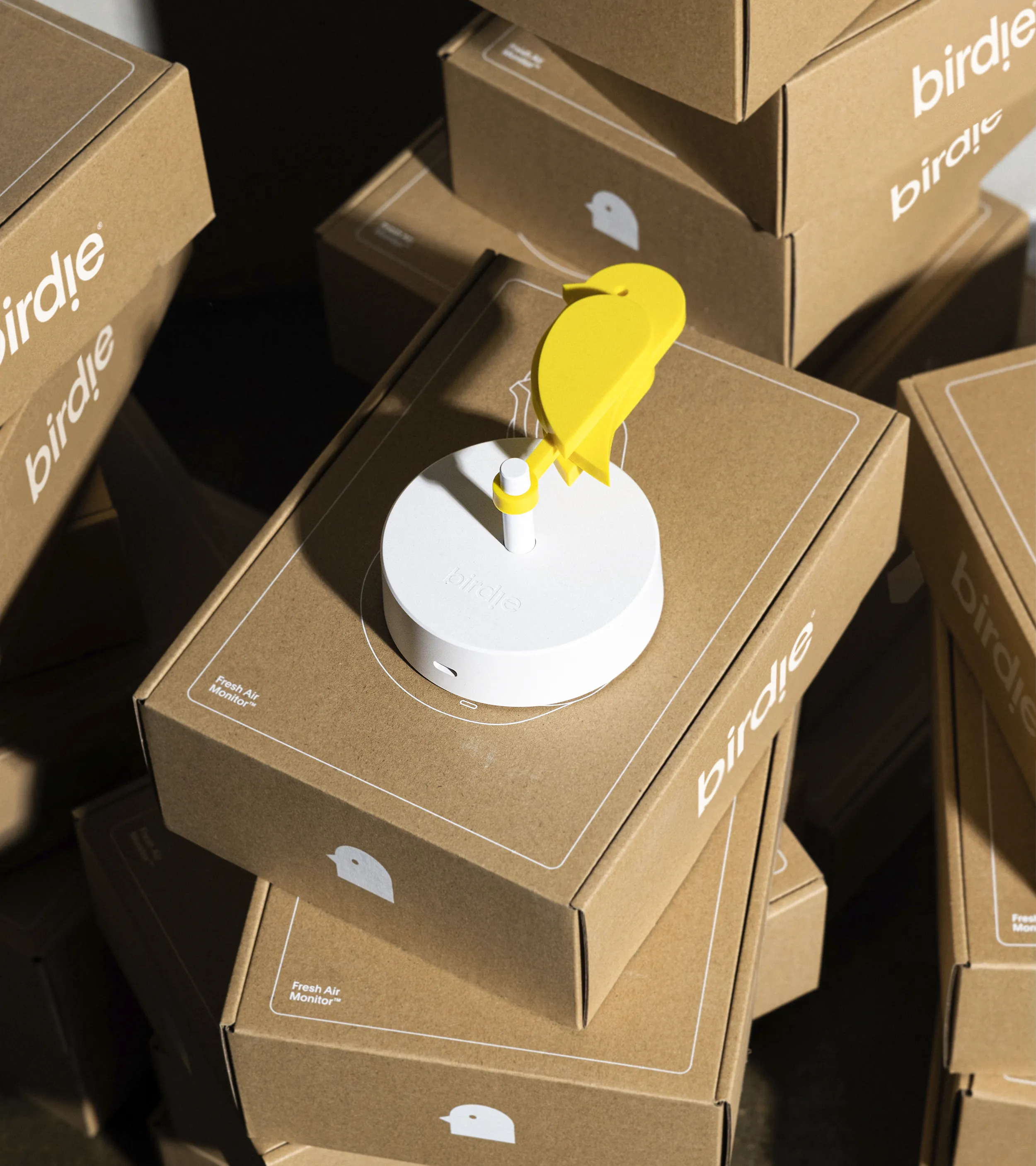
Birdie is a visual Fresh Air Monitor that helps people worldwide achieve a better indoor climate. When the bird dies, it's time to open your windows and bring it back to life.




Highlight


Highlight




Highlight




Highlight


Highlight
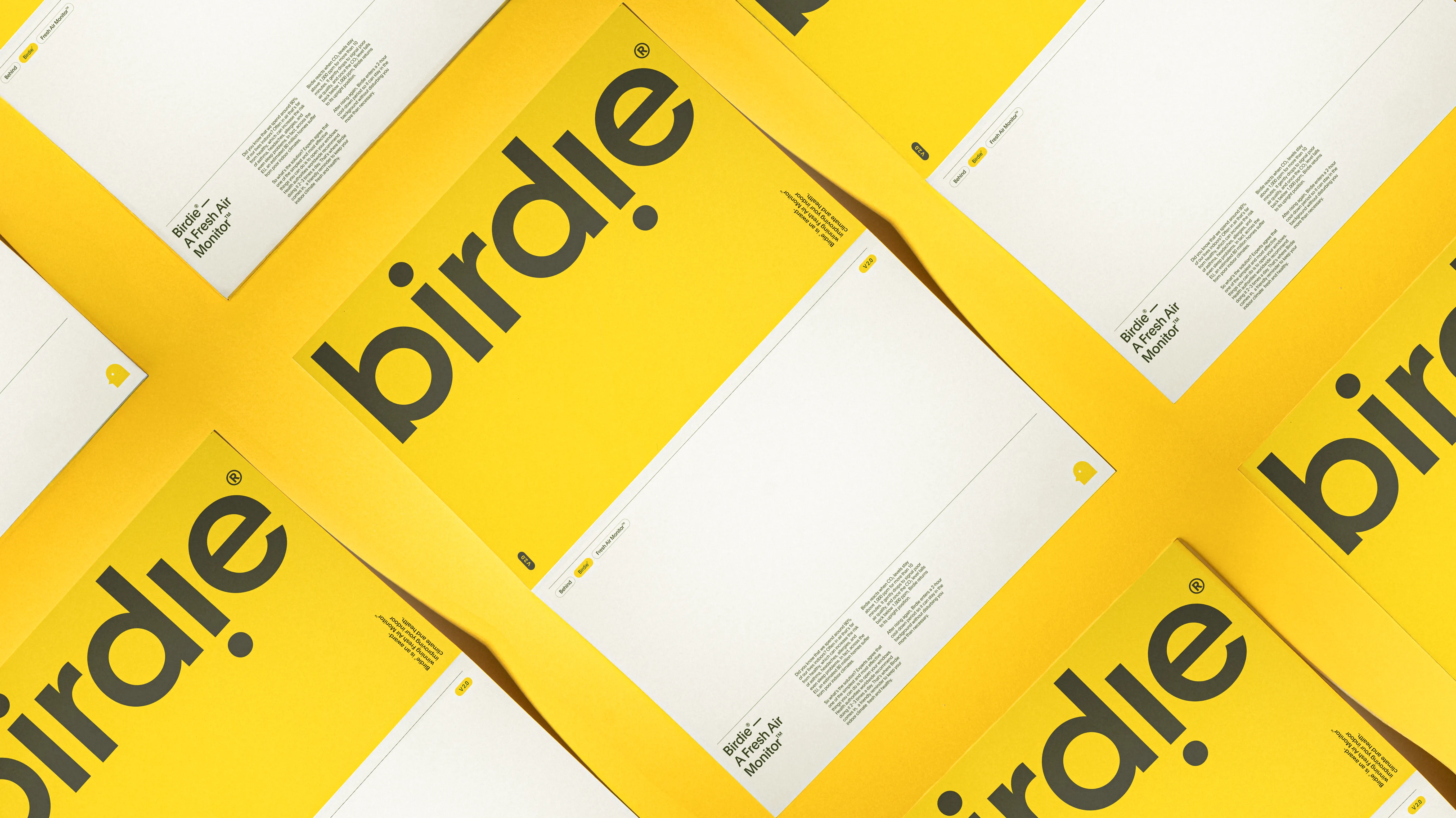
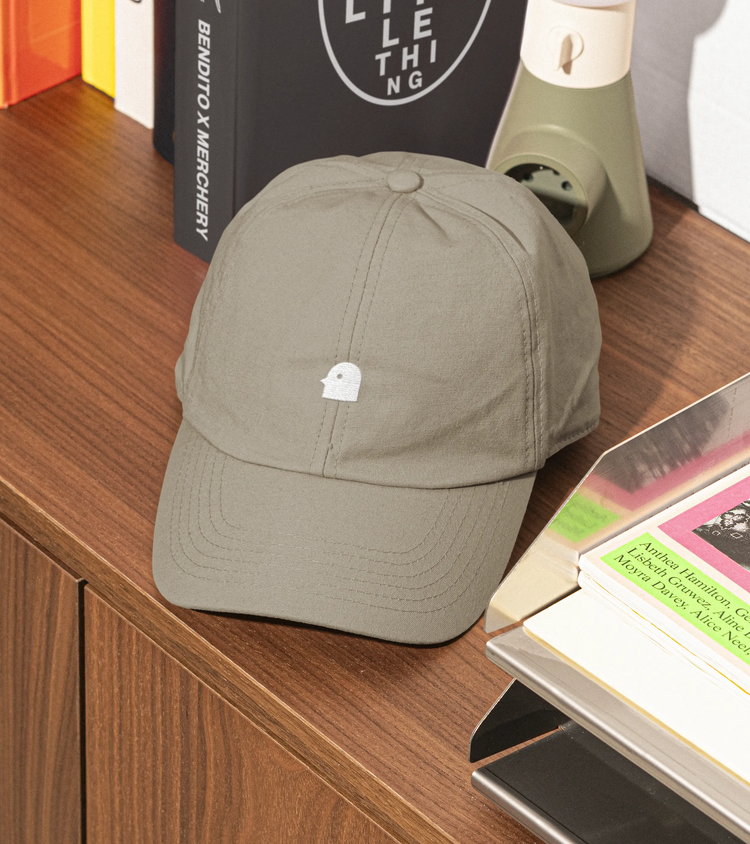
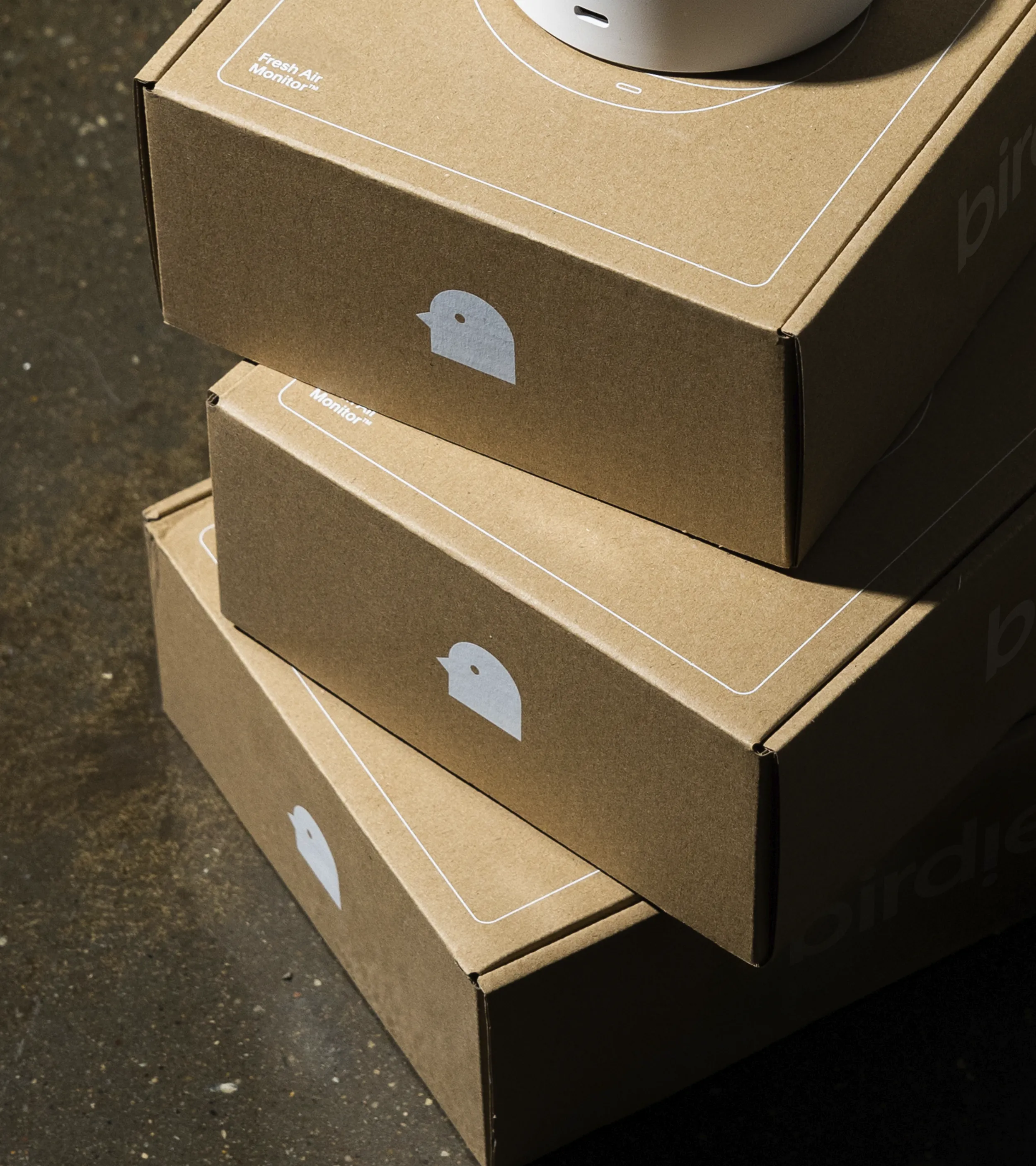
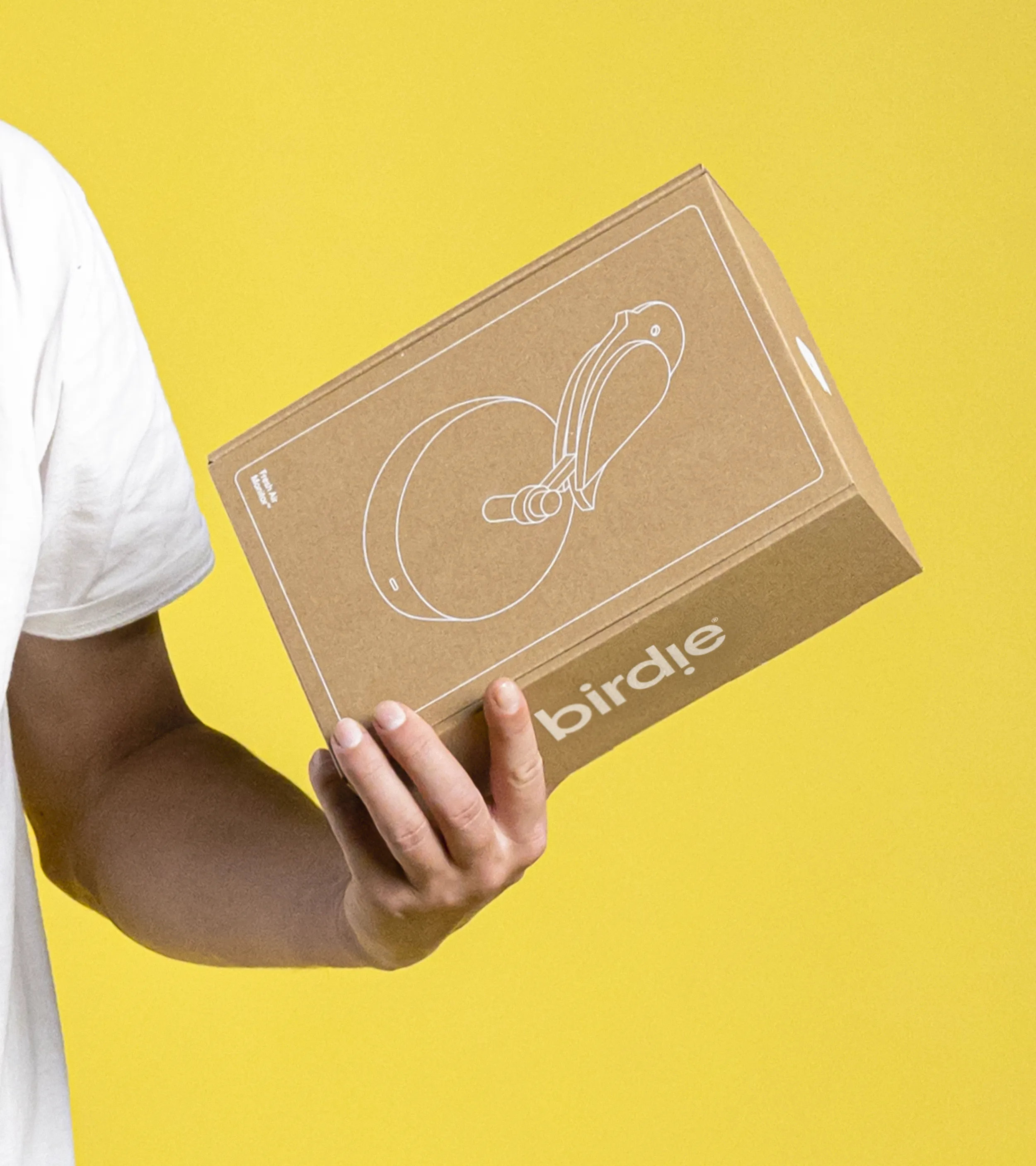
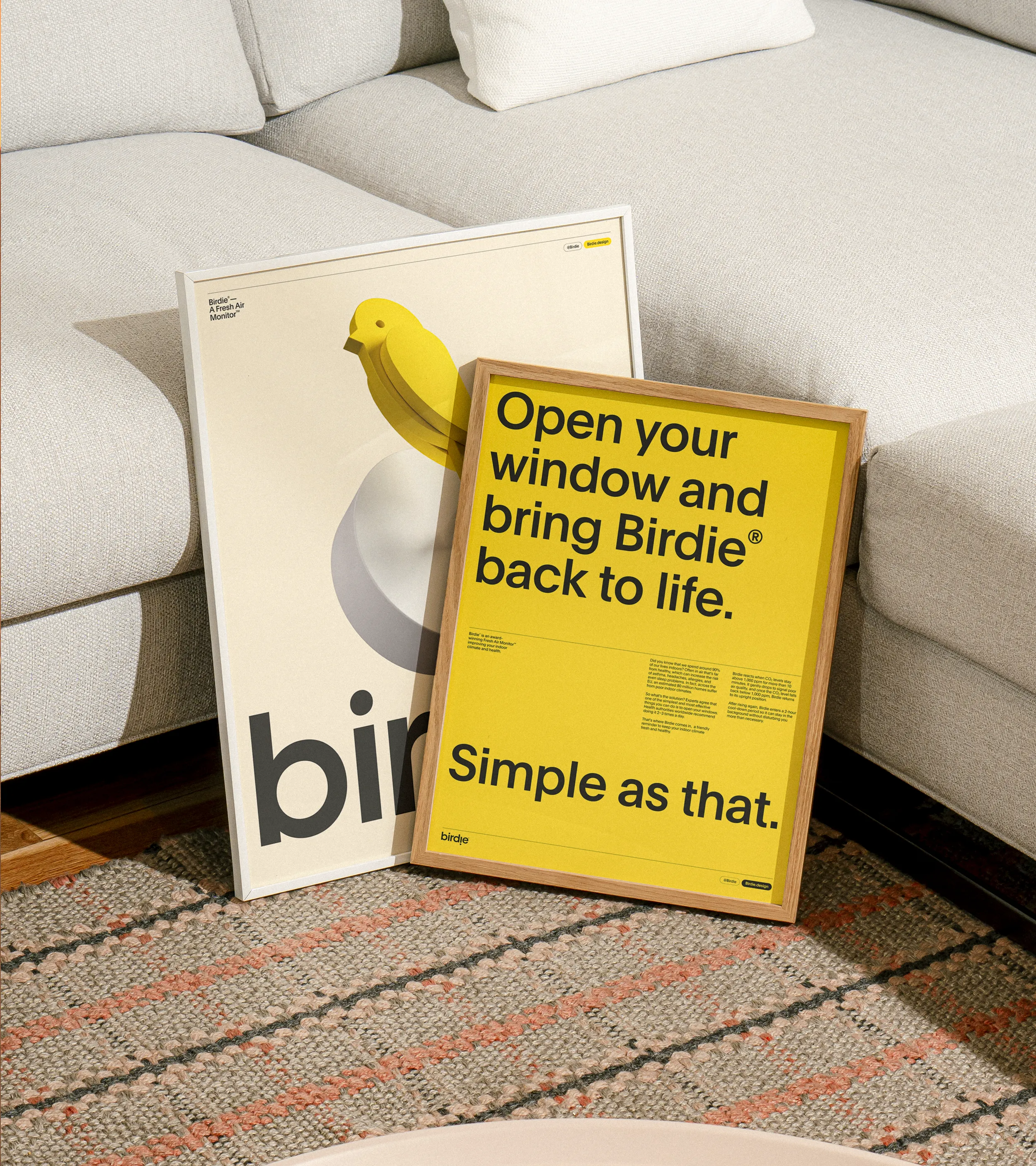
We created a simple, considered visual universe where every element is rooted in the product’s core characteristics. The symbol is directly from the product itself, while the wordmark reflects its round, simple forms. The color palette is built around the product’s strong yellow, giving the identity warmth and clarity. A clean typographic system allows the brand’s playfulness to come through in tone of voice, rhythm, and layout.


Highlight




Highlight


Highlight




Highlight


Highlight




Highlight


Highlight




Highlight


Highlight


Highlight
To build on the product’s intuitive and direct nature, motion became the core, with inspiration form the product’s behavior, the bird dropping and rising back to life. This movement brings a playful quality into the brand, translated through a fluid upward motion in the typographic system. The “i” in the wordmark is designed to resemble the falling bird itself, directly linking motion, meaning, and symbol into one expression.


Highlight
Toolbox
No items found.


